Color is no longer just decoration—it’s direction.
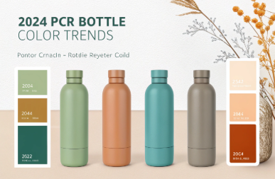
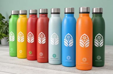
In 2024, Pantone’s palette reports are shaping how PCR (Post-Consumer Recycled) bottles look on shelves, aligning sustainability with sophistication through muted tones, earthy hues, and refined translucence.
Here’s what’s trending—and how to apply it to your next packaging project.

What Are the Top Color Palettes Shaping PCR Packaging in 2024?
Sustainability no longer wears just green.
Pantone’s 2024 reports highlight palettes that reflect calm, circularity, and confidence—perfect for brands using PCR packaging to convey responsibility and modernity.
2024 Pantone-Inspired Color Families for PCR Bottles
| Palette Theme | Key Colors | Emotional Effect |
|---|---|---|
| Quiet Luxury | Ecru, Pearl Gray, Dusty Rose | Minimal, premium, serene |
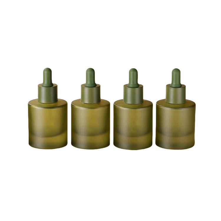
| Organic Warmth | Clay Brown, Olive Green, Soft Terracotta | Natural, earthy, grounded |
| Digital Serenity | Mist Blue, Pale Lilac, Foggy Mint | Clean, tech-forward, cool |
| Future Neutrals | Greige, Translucent Taupe, Cool Sand | Versatile, subtle, professional |
These palettes are not just for fashion—they directly influence product photography, web design, and most importantly, the tone your packaging sets on shelf.
How Do Pantone’s Seasonal Reports Influence Beauty Bottle Aesthetics?
Color forecasting isn’t about guessing—it’s strategic visual storytelling.
Pantone’s seasonal reports shape how design, marketing, and packaging teams plan product launches, especially in industries like beauty and wellness where shelf impact matters.
For example:
-
Pantone 13-1023 “Peach Fuzz” (Color of the Year 2024) aligns perfectly with PCR dropper bottles in soft matte coral tones.
-
Pantone’s “Sustained Bloom” theme promotes muted floral and plant-based colors—ideal for brands using essential oils or botanical serums.
-
Metallic neutrals from Pantone’s “Crafted Comfort” trend are reflected in frosted PCR jars with gold or rose foil caps.
At PauPack, we interpret Pantone insights into practical pigment blends that comply with recycled resin constraints—balancing trend with feasibility.
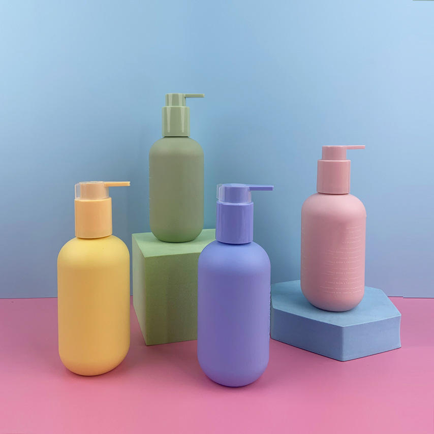
Why Earth Tones and Translucent Neutrals Dominate Eco-Pack Design?
The more natural your product, the more grounded your packaging should feel.
In 2024, earthy palettes and soft transparencies are dominating PCR bottle designs because they signal authenticity, low-impact production, and clean ingredient values.
Why these colors work:
-
Translucent Olive & Sand feel “unfiltered,” echoing unprocessed beauty formulas
-
Matte Greige and Clay match refill culture and minimalism
-
Amber hues continue to trend in aromatherapy for both UV protection and visual warmth
Even in digital-first brands, muted colors photograph better, avoiding glare and harsh contrast. PauPack offers low-MOQ access to PCR bottles in natural tones using both pre-colored PCR resin and water-based coating systems that preserve recyclability.
How PauPack Interprets Color Trends in PCR Bottle Customization?
Not all pigments play well with PCR—but we know what does.
PauPack adapts Pantone-inspired color trends using eco-safe, supply-chain-friendly finishes that are compatible with recycled PET, PP, and HDPE bottles.
Our design-to-production workflow includes:
-
Color matching via Pantone + PCR pigment libraries
-
In-house testing for UV fade resistance and chemical reactivity
-
Coating options: frosted, soft-touch, speckled, or translucent glaze
-
Branding layers: foil-stamp, silk print, label-free laser mark
Whether you're going for an earthy skincare line or a minimalist wellness brand, we help you visualize with 3D renderings, approve with samples, and scale with confidence—all color-compliant and sustainability-ready.
How Brands Can Use Color Psychology to Strengthen Sustainability Messaging?
Color tells the customer what kind of product—and what kind of brand—they’re about to trust.
Brands using PCR bottles can enhance sustainability narratives by pairing packaging colors with emotional cues like calmness, nature, or ethical intention.
Color Psychology for Eco Branding
| Color | Meaning | Ideal Use |
|---|---|---|
| Olive / Forest Green | Natural, grounded, eco-focused | Plant-based skincare, oils |
| Clay / Terracotta | Authentic, handmade | Balms, artisan batches |
| Soft Gray / Ecru | Transparency, minimalism | Medical skincare, refill packs |
| Amber / Bronze | Heritage, warmth | Aromatherapy, tonics |
At PauPack, we help brands go beyond color as a trend—and use it as a tool to reinforce values, stand out in sustainable beauty, and connect emotionally with consumers across markets.
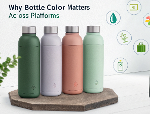
Why Visual Cohesion Across Platforms Starts with Bottle Color?
Your packaging color sets the tone—online and offline.
In a multi-channel world, where product photos live on Amazon, Instagram, and retail endcaps, color cohesion across platforms builds trust, recognition, and brand memorability.
Key benefits of unified color strategy:
-
Consistency from screen to shelf reduces buyer hesitation
-
Branded tones (e.g., muted olive or dusty lilac) enhance recall
-
Visual match to tone-of-voice: Calm neutrals for clean beauty, terracotta for artisanal feel
-
Influencer-friendly aesthetics: PCR bottles in soft, camera-friendly hues photograph beautifully
At PauPack, we help brands plan color across the full customer journey—from unboxing to Instagram styling—using recyclable-friendly pigments that look good and last long.
What Technical Limits Affect Color Customization in PCR Materials?
PCR is sustainable—but it’s not a blank canvas.
Because recycled resins often carry slight tints, especially in PET or PP, not every Pantone shade can be matched 1:1 in PCR material without layering or coating.
Challenges in Coloring PCR Bottles
| Factor | Constraint | Solution |
|---|---|---|
| Base resin tint | PCR PET may be light gray or greenish | Use deeper colors or tone-correcting pigments |
| Heat sensitivity | PCR resin limits some coating types | Apply low-temp curing finishes |
| Additive compatibility | UV-stabilizers may affect tone | Balance additive % carefully |
| Gloss inconsistency | PCR tends to matte | Use soft-touch or frosted overcoats intentionally |
PauPack performs in-house pigment testing on every new shade request to ensure feasibility across production volumes—and helps brands select tone families that complement, not fight against, the PCR base.
How PauPack Translates Color Trends into Scalable Bottle Designs?
Good design doesn’t just follow trends—it makes them work at MOQ and manufacturing scale.
PauPack specializes in adapting 2024 color insights into workable, scalable PCR packaging solutions that brands can actually launch—not just dream about.
Our process:
-
Color Strategy Kickoff: We help select Pantone-adjacent tones based on your target market, resin type, and brand theme
-
Material Compatibility Test: We simulate color on various PCR types (PET, HDPE, PP)
-
Finish Mapping: Determine if pigment, spray, or coating is best
-
MOQ Plan: Offer both low-volume pilot and bulk run pricing
-
Pre-production Sample Kit: Real-world mockups for your marketing team
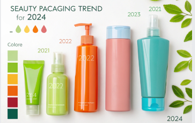
From dusty blush serum bottles to foggy amber roller jars, our color-led designs balance trend appeal with real production viability.
Which Finish Types Work Best with 2024’s Color Palettes?
Color is only half the look—finish gives it character.
The 2024 color trend leans heavily on natural matte, soft-touch, and frosted effects that pair beautifully with calm, muted tones.
Top Finishes for PCR Bottles in 2024
| Finish | Best For | Vibe |
|---|---|---|
| Matte coating | Serums, skincare | Clean, soft, premium |
| Frosted PET | Toners, sprays | Gentle, translucent, fresh |
| Soft-touch lamination | High-end drops or oils | Velvety, sensorial |
| Speckle or stone-texture effect | Sustainable collections | Earthy, natural, authentic |
| Gloss only in detail | Cap logos, collars | Contrast & visual hierarchy |
At PauPack, we offer all these finishes using low-VOC and compostable-compatible coatings, ensuring your eco story stays intact from material to message.
How to Build a Timeless Yet Trend-aware PCR Packaging Line?
Trends shift—but the smartest brands don’t repackage every year.
The key to long-term impact is using color to express your core identity, while layering seasonal accents through closures, labels, or limited-edition series.
Brand-safe Color Strategy
-
Anchor your bottle line in 1–2 signature tones (e.g., olive + stone)
-
Use neutral PCR tones for refill packs
-
Update caps or seals with seasonal Pantone pops
-
Keep typography, logo placement consistent
-
Bundle full packaging kits (jar + box + insert) with color match
PauPack’s design team helps brands build color systems, not just SKUs, allowing for seasonal flexibility without starting from scratch. That means you stay visually relevant, without waste or reinvestment.
Conclusion
2024’s color trends reflect a shift toward soft power—calm, honest, intentional. With PauPack, your PCR bottles don’t just follow the trend—they lead it with clarity, sustainability, and timeless appeal.