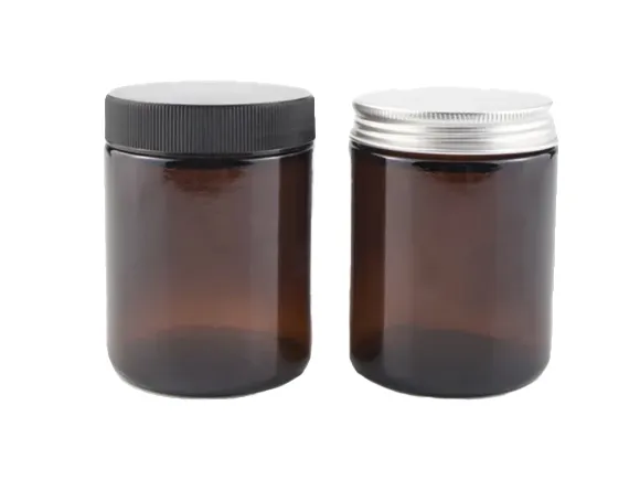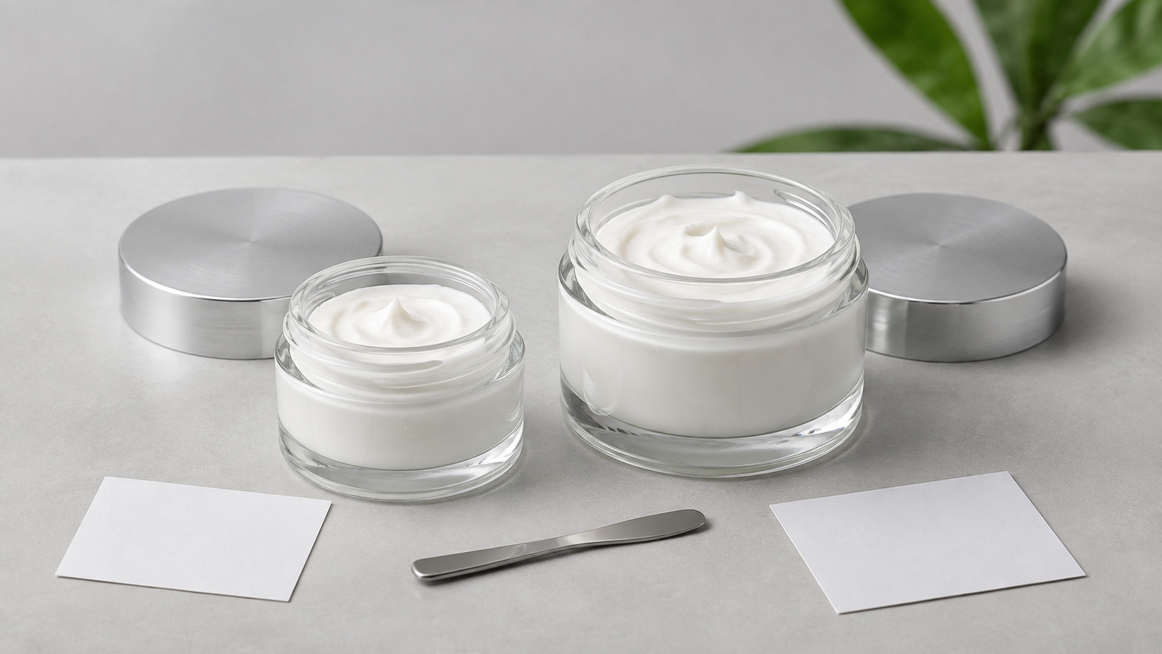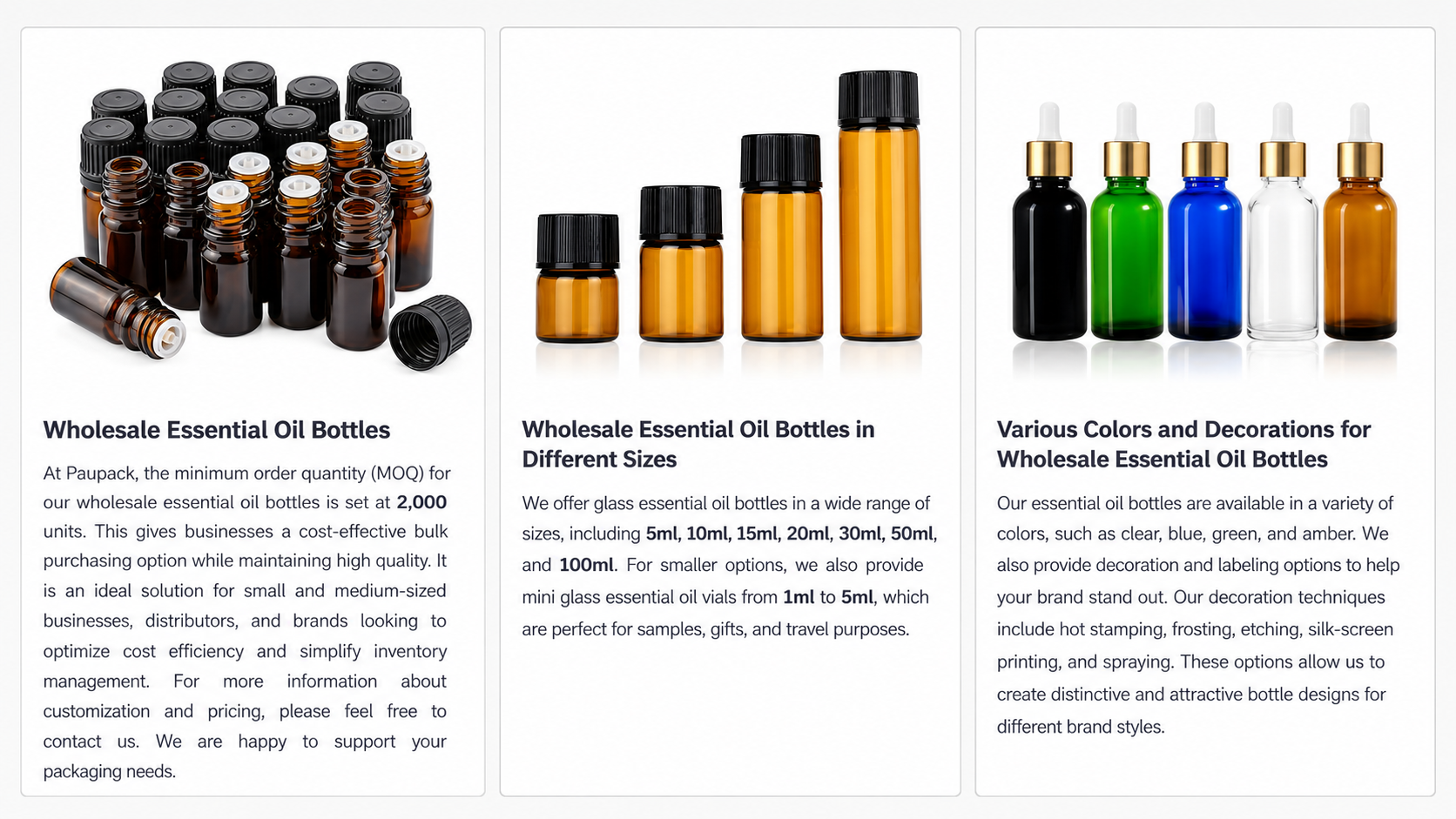


Frosted packaging creates an immediate impression. It softens reflections, gives the container a more tactile visual character, and can make a familiar jar shape feel more refined. For skincare brands, frosted glass cosmetic jars offer a way to build a distinctive product experience without relying on a complicated container design.
The finish still needs to work with the formula, cap, decoration, product photography, and price position. A jar that looks elegant in a supplier image may feel very different once it is filled, printed, placed in a carton, and used every day. This article explains how to evaluate frosted glass jars from the customer's point of view and turn the finish into a consistent brand asset.
What does a frosted finish change?
Clear glass makes the formula and internal fill level highly visible. Frosting diffuses that view and creates a softer surface. Depending on the jar, color, and formula, customers may still see a hint of the product through the glass, but the overall appearance feels less transparent and more controlled.
This can be useful when a brand wants a calm, premium, clinical, or sensorial direction. Frosting also provides a neutral background for printing, labels, metallic details, and custom-colored caps. It does not automatically make every package look luxurious, however. The proportion of the jar, quality of the finish, cap design, and artwork still determine the final result.
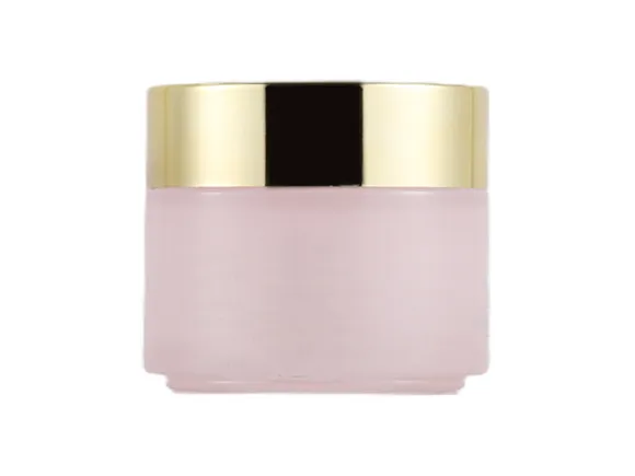
Clear, frosted, or color-coated glass?
These three approaches create different customer expectations. Choosing between them is easier when the team starts with the intended product experience rather than treating the surface finish as an isolated decoration.
| Glass appearance | Customer impression | Useful for | Questions to review |
|---|---|---|---|
| Clear glass | Transparent, direct, product-focused | Formula visibility, clean beauty, clinical presentation | Does the formula color remain consistent and attractive? |
| Frosted glass | Soft, refined, calm, and tactile | Face creams, masks, eye care, premium skincare ranges | Is the finish even, durable, and compatible with decoration? |
| Color-coated glass | Bold, controlled, and highly brand-specific | Strong color systems and coordinated product families | How will color tolerance and surface wear be controlled? |
A brand can also combine these approaches. A frosted jar may use a subtle tint, or a clear area may be preserved to reveal the formula. The right choice depends on whether customers should focus first on the product inside, the overall brand color, or the tactile appearance of the container.
Frosted glass cosmetic jars for different brand styles
Minimal and clinical skincare
Pair a white or softly frosted jar with a simple cap, limited color, and clear typography. The finish can reduce visual noise while giving the package more character than plain clear glass. Keep decoration precise and make important product information easy to read.
Prestige and luxury skincare
Use proportion and detail rather than decoration alone. A stable glass base, controlled frosting, metallic cap, and carefully placed logo can create a more convincing premium impression than several competing effects. The opening and closing experience should feel equally considered.
Botanical and sensorial products
Soft green, amber, rose, or neutral tones can be combined with frosting to support a botanical or spa-inspired direction. A matte, wood-look, or restrained metallic cap can reinforce the concept. Avoid claims about sustainability or natural materials unless the actual components support them.
Modern color-led brands
Frosted glass does not need to be neutral. Different jar or cap colors can help customers distinguish day and night products, face and eye care, or multiple formulas in one range. Build a clear system so color communicates product roles instead of becoming decoration without meaning.
Match the cap to the frosted surface
The cap is one of the largest visible elements, so it can strengthen or weaken the effect of the glass. A silver cap creates a cooler, technical look. Rose gold or warm metallic finishes can make the package feel softer. Black adds contrast, while white or a matching matte color creates a more seamless appearance.
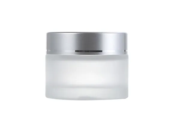
Evaluate the cap beyond color. Check its height, edge profile, closing position, and the way it feels when opened repeatedly. If the cap includes a liner or inner component, review the complete filled system. Customers experience the glass and closure together, not as separate specifications.
Choose decoration that remains clear on a frosted jar
Frosted surfaces can provide an attractive background for screen printing, hot stamping, labels, and other decoration, but contrast still matters. Fine text, pale colors, or small logos may lose impact if the finish and artwork are too similar.
Ask for artwork samples on the final jar finish and color. Review them under retail lighting, daylight, and the lighting used for product photography. A metallic logo may look strong from one angle and less visible from another. A label may need a different adhesive or surface area than it would on clear glass. Physical samples reveal these details more reliably than a digital mockup.
Use size and proportion to support the product
Frosting can unify several jar sizes, but each capacity still needs to suit the product routine. A compact jar works well for eye care or concentrated treatments. Medium formats suit many daily face creams and masks. Wider openings can make rich balms and body products easier to use.
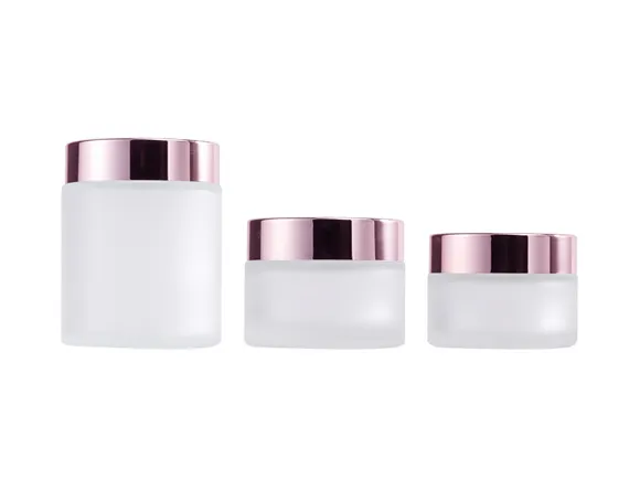
Compare the complete size family before approving one jar. Look at cap proportions, logo position, label area, and how the finish appears across different glass thicknesses. Customers should recognize the range even when the containers are not identical.
The article on cream jar packaging for skincare brands explains how capacity, opening, closure, and use pattern affect the wider packaging decision.
Think about ecommerce and product photography
Many customers will first see the jar as a small image on a product page. Frosted glass can photograph beautifully, but soft surfaces and pale colors may lose definition against a light background. Plan photography with enough contrast to show the jar shape, cap, logo, and formula category clearly.
Use consistent angles and lighting across the product range. If color coding is important, make sure the difference remains visible on mobile screens. The carton and shipping protection also matter because scuffs, dust, or surface marks can reduce the premium effect by the time the package reaches the customer.
Evaluate how the finish behaves in everyday use
A skincare jar is handled with damp or product-covered hands, opened on a bathroom shelf, carried in a bag, and photographed after repeated use. Review whether fingerprints, rubbing, product residue, and cleaning change the appearance in a way the brand accepts.
Test decorated samples with the actual formula and intended closure. Look for changes in the glass finish, printed areas, labels, cap surface, and overall color. The brand or its testing partner should complete formula compatibility and stability work under conditions relevant to the product and market.
Build a coordinated frosted packaging family
A consistent family is often more valuable than one highly decorated hero jar. Decide which elements will repeat across face cream, eye care, mask, and body care products. These may include the frosting level, cap color, logo position, label layout, or a controlled set of product colors.
PauPack's article on custom cosmetic jars for skincare brands covers how to combine jar construction, color, caps, and decoration into a recognizable product system. Use the frosted finish as one part of that system rather than the entire brand idea.
Common mistakes when choosing frosted jars
Assuming all frosting looks the same
The visual result can vary by glass, surface process, color, and production standard. Compare several samples and define what an acceptable finish looks like for the project.
Choosing a pale logo with too little contrast
A subtle design can become unreadable when placed on a soft surface. Test real artwork at its final size and review it from normal viewing distance.
Ignoring the formula color
Some formulas remain partly visible through the glass. Fill the jar before approving the color direction so the product and container work together.
Focusing on the jar and forgetting the cap
The cap can dominate the final design. Its finish, height, closing position, and tactile quality should be considered at the same time as the glass.
Approving only a digital rendering
Renderings are useful for direction, but they cannot fully show surface texture, print opacity, reflections, or handling marks. Approve production-equivalent physical samples.
What to include in a frosted jar brief
Give the supplier enough information to recommend relevant samples and decoration options:
- Product type, formula characteristics, and target fill volume.
- Preferred jar shape, opening, glass color, and frosting direction.
- Cap style, color, liner, and inner disc requirements.
- Logo, printing, hot stamping, label, or coating ideas.
- Expected quantity, destination market, filling method, and launch schedule.
- Related sizes needed for future product extensions.
Browse PauPack's cosmetic packaging product range for starting formats. For a wider material perspective, see the article on eco-friendly glass cosmetic jars.
Frequently asked questions
Do frosted glass cosmetic jars hide the formula completely?
Not always. Visibility depends on the frosting, glass color, thickness, formula color, and lighting. Fill a sample with the actual product before approving the final appearance.
Can a frosted glass jar be printed or labeled?
Yes, several decoration approaches may be available. The artwork, ink, foil, label, and adhesive should be tested on the final surface because contrast and adhesion can differ from clear glass.
Which cap colors work well with frosted glass?
Silver, gold, rose gold, black, white, matte colors, and matching custom colors can all work. Choose the cap according to the brand direction and review its proportion and opening experience, not only its color.
Are frosted jars suitable for a complete skincare range?
They can be, especially when related sizes share a consistent frosting level, cap treatment, and artwork system. Confirm that the required capacities and openings are available before building the full design around one jar.
Make the finish part of a complete customer experience
The strongest frosted glass cosmetic jars do more than look soft or premium. Their finish, proportions, cap, decoration, formula presentation, and product family all support the same brand promise.
PauPack works with beauty brands on cosmetic packaging selection and customization. Learn more about PauPack's packaging experience, or contact the team with your formula type, target size, preferred finish, cap direction, and artwork ideas.